LU pendants: Beaverhausen's first lighting design
Beaverhausen are the designers behind our pendant LU. Beaverhausen is a design studio based in Brussels founded by Mimi A. Diar and Ad Luijten. The two designers were originally Art Directors in the advertising industry but the couple decided to put their acquired skills into their true calling: design. Their career within advertising recurs in the strong sense of storytelling reflected in all their designs.
“We see our work as telling stories that manifest themselves in furniture, objects, lighting and interiors”
– Beaverhausen
They aim to create visual stories and evoke feelings. Every design has its own theme emphasising the context of use, manufacturing process and a more poetic source of inspiration. They always strive to create a story that connects to its surroundings in a simple and engaging way. Letting the design be a communicator of the message.

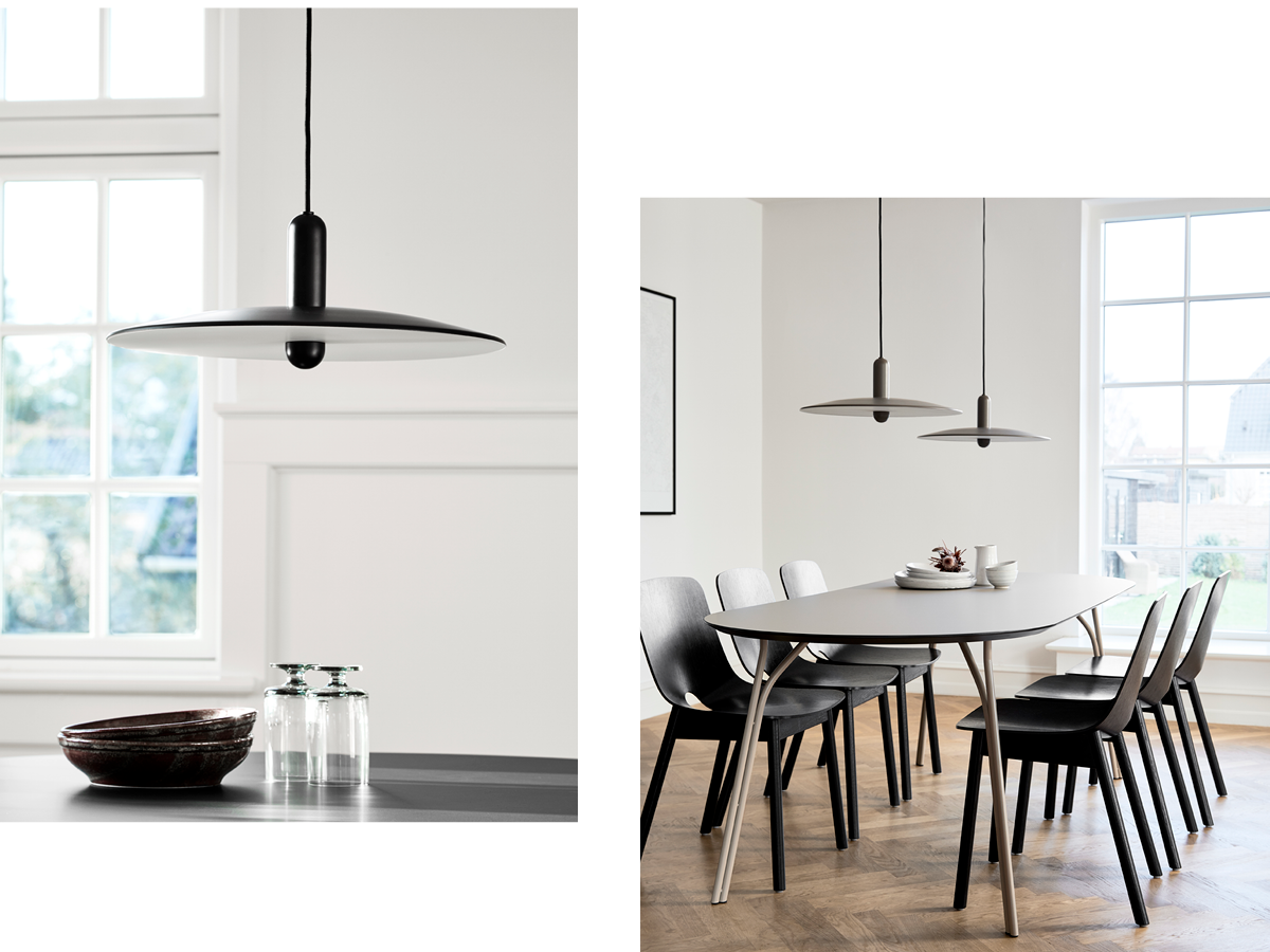
The design of the LU pendant arose by accident. While the designer couple planned the renovation of their own home, a personal preference for a thin lampshade came to mind. “Our kitchen gives direct access to the garden. We quickly wondered which lamp would be most suitable above our kitchen table without obstructing the view - and before we knew it, LU was born,” explains Ad Luijten.
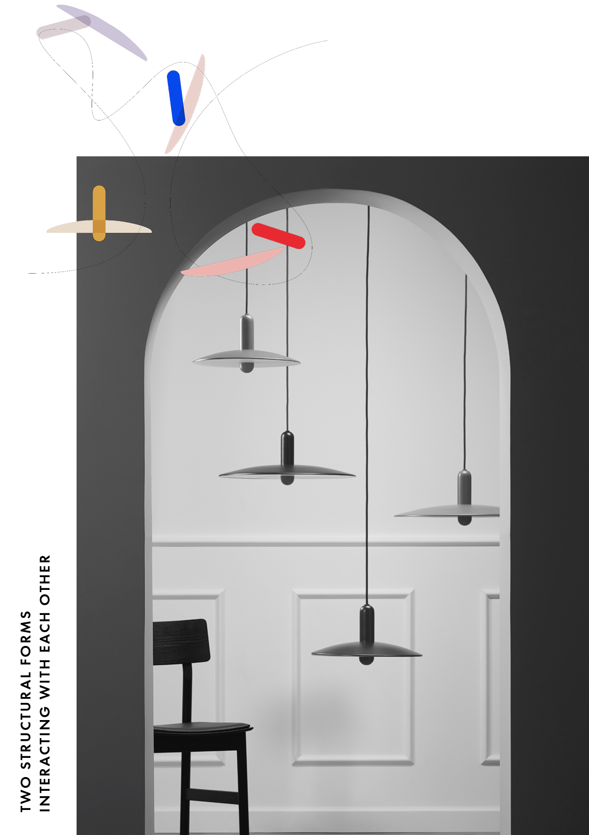
The pendant should realise two features. It should not obstruct the view to the garden and still provide a pleasant and usable light. This vision started an exploration of geometrical forms and figures. Revealing in the two contrasting forms and their communication with each other. The strong vertical element is chosen to harmoniously connect the interior with the lines of plants and trees in their garden. The shape of the lampshade is intended to look subtle at eye level but once seated at the table, it should effortlessly fill the room with light and contemporary charm.
The LU pendant is Beaverhausen’s first lighting design. LU is all about two contrasting forms and their interaction with each other. A bold vertical element appears to float through the thin elegant light source. Formed by a circular shade. Beautifully floating in the air.
The combination of these two distinctive shapes results in an appealing design that is perfectly balanced. Modest in a formal setting and playful in a more vibrant environment. Scandinavian lighting and the love for pure readable lines inspired the character of LU. Named after the French word for light ‘lumière’.
Balanced.
Beautifully floating in the air without taking unnecessary space

